Discover how we go beyond possible with our brand
Download the Brand AssetDiscover how we go beyond possible with our brand
Download the Brand AssetThe Tredence brand
At Tredence, we focus on and excel at solving the last-mile problem in data science. We believe that the last-mile adoption of data science is crucial to empower decisions and help clients win. And by bridging the gap between insight creation and value realization, we propel businesses to push the boundaries of what’s possible.
Realizing value from data science is a marathon, not a sprint. But businesses often forget this and falter in the last mile. Because creating insights is easy, but translating them to outcomes is hard. Because most data science partners lack the strategic focus and far-reaching innovation needed to connect data to insights to meaningful actions.
That’s where Tredence comes in - providing end-to-end implementation and value-realization for businesses that are going to win with data. Our brand empowers our partners and #Tredencians to go beyond possible and deliver extraordinary impact.

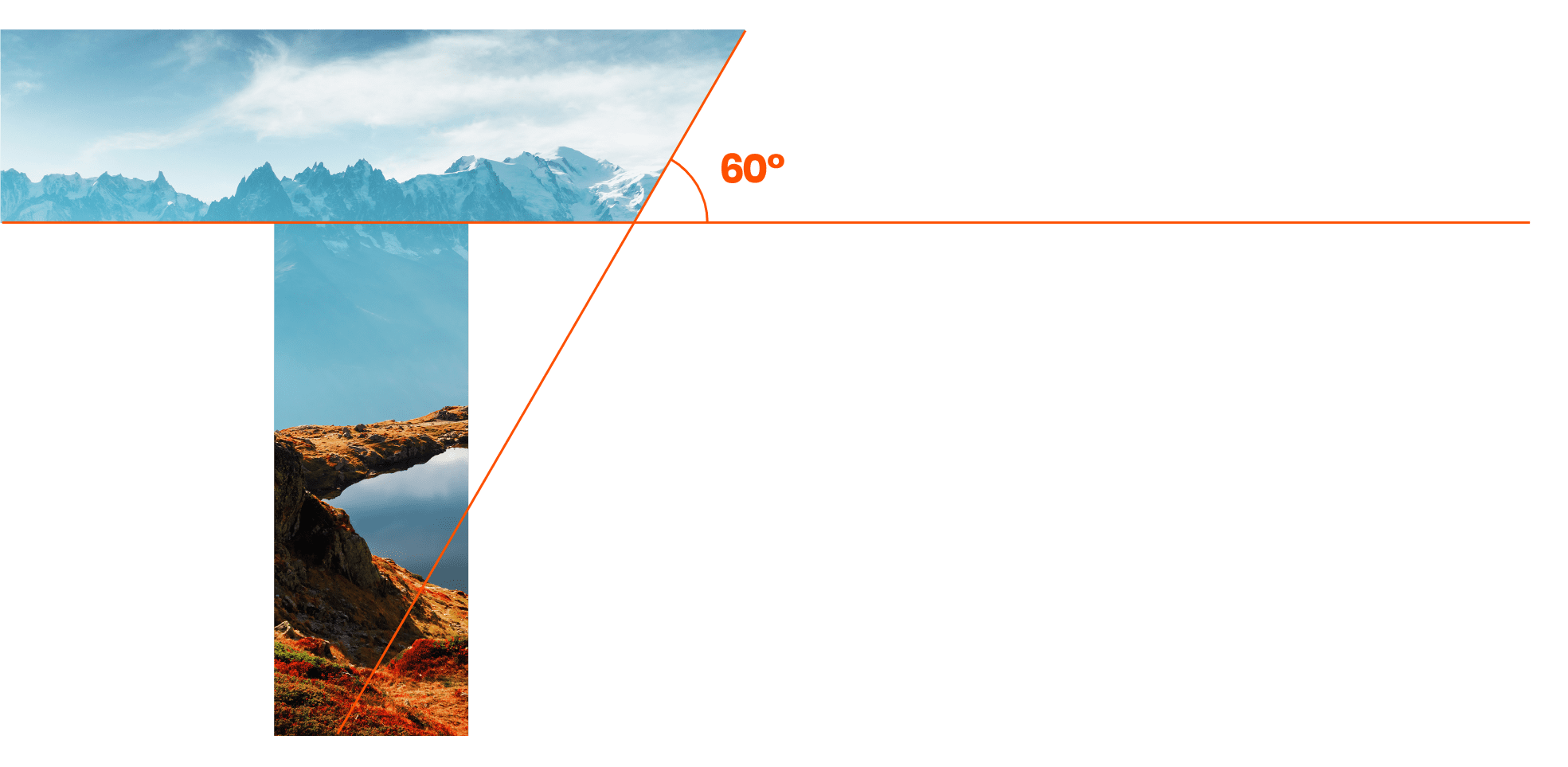
The logo for Tredence is an attempt at a timeless piece of design. It’s a simple ’T’ with an angled cut on the top right. The simplicity of the design helps it appear bold and confident. The cuts in our logo are angled at 60° to pay homage and carry on the legacy of our old logo.
Our choice of colors symbolizes our brand purpose. We’ve retained what we liked from our past - Bright Orange as the primary color – and we have complimented it with new colors to signal a new step into the future.

We’ve chosen a unique and well-rounded font to demonstrate our clarity of thought and purpose as we surge ahead with a bold new vision. This new font will help us create a global consistency across all our communications.
Using images that represent the adventurous attitude and friendly nature of Tredence, we convey our brand essence of companionship, aspirations, and the thrill of exploration. This imagery style brings personality to all our assets and showcases our diverse community.
